A research-driven redesign of two SaaS websites, improving information architecture, checkout conversion, and onboarding to drive over $1M in monthly recurring revenue from new user conversions.
Role
UX/UI Designer
Company
Citrix
Project Type
Website Redesign, UX Research
Project Goals
Establish a Research Baseline
Use Qualtrics surveys and UserTesting sessions to understand where users were struggling, set SUS and NPS benchmarks, and define what success looked like before touching a single layout.
Fix the Information Architecture
Reorganize a fragmented site structure dead-end pages, unintegrated acquired product pages, missing breadcrumbs, inconsistent templates into a coherent, maintainable web ecosystem.
Simplify the Checkout and Pricing Flow
Reduce friction in the buy flow, eliminate terminology conflicts between “Free Trial” and “Buy Now,” and make the final price legible before users hit the payment step.
Improve New User Onboarding
Design a seamless path from website conversion into the product so users who signed up didn’t drop off before experiencing the core value of ShareFile.

Project Summary
ShareFile had grown inconsistently over years of acquisition. Fragmented IA, a checkout flow that was losing users, and a visual language misaligned with the product and brand. RightSignature had the same problems.
My role covered both. Research, IA, UX, UI design, and illustration. The goal was turning two disconnected marketing websites into clear, conversion-optimized experiences that matched the quality of the products they were selling.

01 – Research & Baseline
Before redesigning anything, we needed to know what was broken and by how much. We ran moderated and unmoderated UserTesting sessions asking users to complete a purchase on the existing site. Only 2 out of the group completed the task, and it took nearly 5 minutes.

The findings were clear. The checkout flow was too long, asked for too much information upfront, and confused users with conflicting “Free Trial” and “Buy Now” language on the same screens. One user couldn’t complete their purchase at all. We also ran Qualtrics surveys to gather broader feedback on navigation, content clarity, and overall satisfaction, establishing SUS and NPS baselines we could measure against after launch.
02 – Information Architecture
The existing site structure had grown without a plan. Marketo pages that dead-ended. Acquired product pages that weren’t integrated with the main site. Subpages with no parent or breadcrumb. Multiple page templates for similar content. Users couldn’t find what they were looking for and the site couldn’t be maintained cleanly by the team running it.
Q1_Design_Rational
We rebuilt the IA from scratch, organizing content into clear, maintainable areas: Pricing & Plans, Resource Center, Support, and Product. Every page had a home. Every path had a destination.


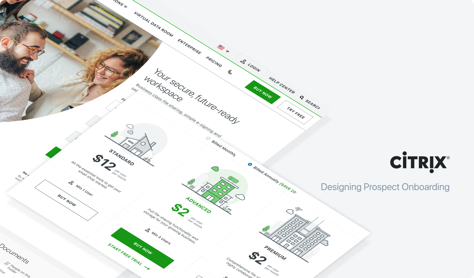
03 – Checkout & Pricing Redesign
The original checkout was a multi-step process that obscured the final price until the end. Users didn’t know how many seats they were being signed up for or why the total looked different from what they expected. Sticker shock right before payment was killing conversions.


The redesigned checkout consolidated everything into a single page with a live price summary that updated as users selected their plan, seat count, and subscription length. Users could see exactly what they were getting and what it cost before committing. Removing that ambiguity was the single highest-impact change we made.
04 – RightSignature
RightSignature was a standalone electronic signature product in the Citrix suite. Its website had the same fragmentation and visual inconsistency problems as ShareFile but it also needed its own identity within the broader brand.

Beyond the homepage and pricing pages, I designed a suite of custom illustrations to give RightSignature and ShareFile a distinct visual personality and mapped the customer journey for e-signature users, identifying where they entered the product, where they dropped off, and what a successful first session looked like.
05 – Onboarding
Customer journey map for new user onboarding, tracking the full path from first website visit through free trial, first meaningful action, and conversion to paid account across both ShareFile and RightSignature

I mapped the full customer journey from first visit through signup, trial, and paid conversion. For e-signature users this meant designing a clear path from ShareFile into RightSignature, helping users understand how the two products worked together and what to do first.
The onboarding flow reduced steps between signup and first meaningful action, carried the visual language from the marketing site into the product, and fixed terminology conflicts we caught in usability testing across both surfaces.


Impact
$1M+ MRR from new users converting to paid accounts after the redesign
SUS score 68 to 73 from average to above average usability post-launch
Checkout completion improved significantly after consolidating a multi-step flow into a single page with live pricing
Keep Going
There is more to explore, rummage through more of my recent design work.
Cyber Risk Quantification
Turning complex threat data into clear, financial insights.
Want to see more?
Explore my complete portfolio.
Hope to hear from you
Please, take a moment and send a message and lets connect.

